Web design moodboard: a worksheet for clear direction
Build a web design moodboard that connects references to type, imagery and layout decisions. Use a worked example and a practical approval worksheet.

Direct answer
A web design moodboard is a curated set of references for a website's visual direction: typography, imagery, color relationships and overall density. Build it around the site's audience and main task, then explain which decision each reference supports. Approve those principles before using a wireframe to decide page structure.
What belongs on a web design moodboard?
A web design moodboard includes type samples, image treatments, color relationships and examples of visual density, with a note explaining each choice. Avoid treating a collection of complete homepages as the specification. A whole page bundles many decisions, and you may want only its type hierarchy or the space it leaves around text.
Rebekah Read's website examples show moodboards alongside the resulting sites, making the relationship between visual direction and a finished page concrete.[1]
Use that relationship as a check on your own board: which parts could carry into your website, and which are attractive but irrelevant to its content? Keep the original source beside each selection so the team can inspect it later.
Use this reference-to-decision worksheet
For each saved example, write the project need, the observed treatment, the rule you propose and the test that could reject it. This worksheet turns a preference into something a designer can evaluate. A note like 'clean and premium' leaves too much open. A note like 'short headlines, large line spacing and one prominent action' gives the team something specific to discuss.
Here is a hypothetical tutoring website. The need is to help a parent understand the service before booking. A reference uses a short headline above a candid portrait. The proposed rule is to lead with a plain-language promise and an approachable image.
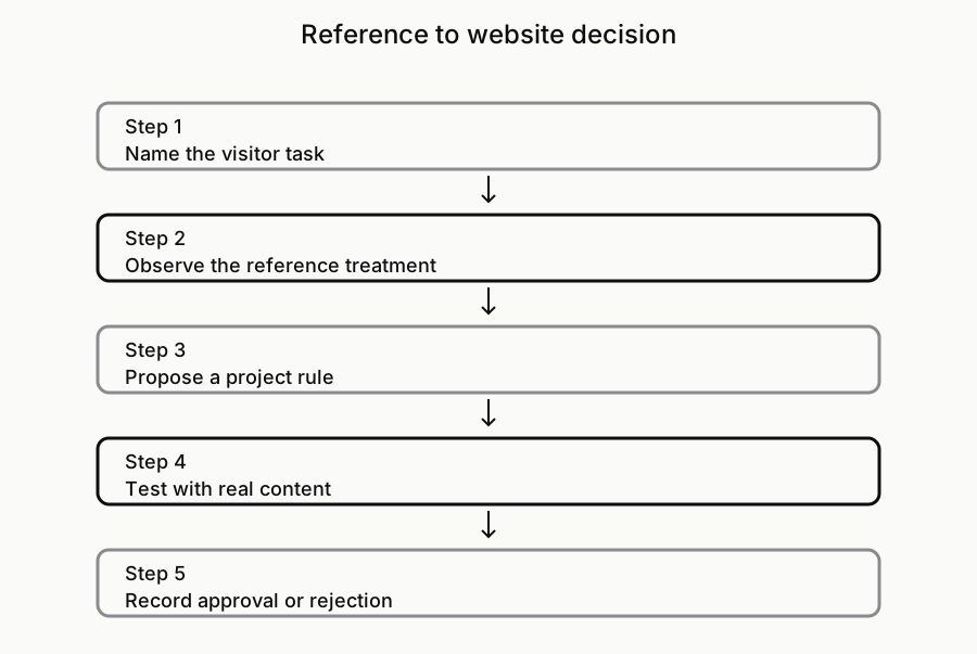
The test is to replace the reference's copy with the real service description. If that copy needs a long explanation, the original composition may not survive. The worksheet diagram below shows the sequence.
- Project need: What should a visitor understand or do?
- Reference: What exact treatment are we observing, and where?
- Proposed rule: What should carry into this project?
- Boundary: What should we avoid carrying over?
- Test: What real content or screen would prove the rule useful?
Give references roles instead of collecting whole sites
Separate the board into the visual decisions you need to make. One reference can explain heading scale, another image crop, and another the balance of empty space and content. Label those roles explicitly. This gives you room to combine techniques without asking the designer to reproduce an existing website. It also reveals gaps: several images of the same hero treatment do not answer how dense product information should look.
Include an example that challenges your favorite direction. If an airy layout looks good with a short caption, test it with a long service name or a real comparison. Keep the challenge beside the attractive example until you resolve it. This is a visual-direction exercise; detailed interaction states and breakpoint behavior belong in their own reference records.
A moodboard and a wireframe answer different questions
The moodboard asks what visual language fits the website. A wireframe asks where content and actions belong. You can explore them together, but approve them separately. Otherwise a stakeholder may accept a beautiful visual reference and accidentally appear to approve its menu, page order or booking journey. Write the question being reviewed at the top of each artifact.
For the tutoring example, the moodboard might favor welcoming photography and readable typography. The wireframe still has to decide whether pricing appears before the tutor's biography, what the booking action opens and where reassurance belongs. The moodboard cannot settle those questions simply by showing a polished competitor homepage. Our moodboard-versus-library guide explains how to keep the selected direction separate from the larger evidence collection.
Ask for approval of principles, not favorite pictures
Present the board with a short explanation of the audience, the visual choices and the decisions still open. Ask the reviewer to approve the relationship between those choices and the project's needs. 'Which image do you like?' can produce a preference without direction. 'Does this level of density make the service feel understandable?' keeps the conversation attached to the work.
Record approval in plain language: keep the calm headline scale; test the portrait treatment; reject decorative texture because it competes with the information. Date that note and keep it with the board. A later request can then be evaluated against a real decision rather than somebody's memory of a meeting. Before building, turn the approved principles into the project's design brief.
Keep a library behind the selected direction
Keep rejected alternatives and source notes in a reference library, while the moodboard holds only the direction currently under review. This lets you revisit a useful technique without reopening every decision. Explore Sesavu's reference-library workflow and check its documentation for current availability. This method works with a document or folder too; it does not depend on an automatic brief or an agent connection.[2][3]
Questions designers ask
Can a website moodboard use references from outside web design?
Yes. Editorial layouts, signage and packaging can suggest hierarchy, spacing or image treatment. Explain the transferable principle and test it with website content; a compelling poster does not automatically work as a page.
Should I put exact font and color choices on the moodboard?
Include proposed choices if they help the decision, but distinguish examples from approved specifications. Verify font availability and color roles when developing the actual design system. A color sampled from a reference is not yet a complete website palette.
Sources checked
- Website moodboards shown beside completed sites — Rebekah Read Creative
- Explore Sesavu — Sesavu
- Sesavu documentation — Sesavu