
Brand moodboard: turn visual taste into decisions
Create a brand moodboard with a clear positioning link, meaningful visual choices and an approval record. Includes a worked example and review worksheet.

Direct answer
A brand moodboard connects a brand's positioning to a proposed visual direction. Gather references for type, imagery, color relationships and graphic treatments, then explain what each choice communicates to the intended audience. Compare distinct directions before approving one. Keep that approval separate from the final logo and brand guidelines.
What should a brand moodboard contain?
A brand moodboard should contain a visual proposal and the reason it fits the brand. Include type direction, photography or illustration, color relationships, graphic motifs and examples of how these elements work together. Keep the positioning statement visible. It gives the reviewer a basis for judging the proposal instead of relying entirely on personal taste.
Lisa Furze starts her process with brand strategy, then explores themes, photography, typography and graphic elements.[1]
ManyPixels distinguishes a moodboard from a detailed brand guide.[2]
Those are useful foundations. The extra step here is to write a decision beside each reference: what audience signal you intend, what interpretation you want to avoid and where you will test the choice.
Try a positioning-to-visual worksheet
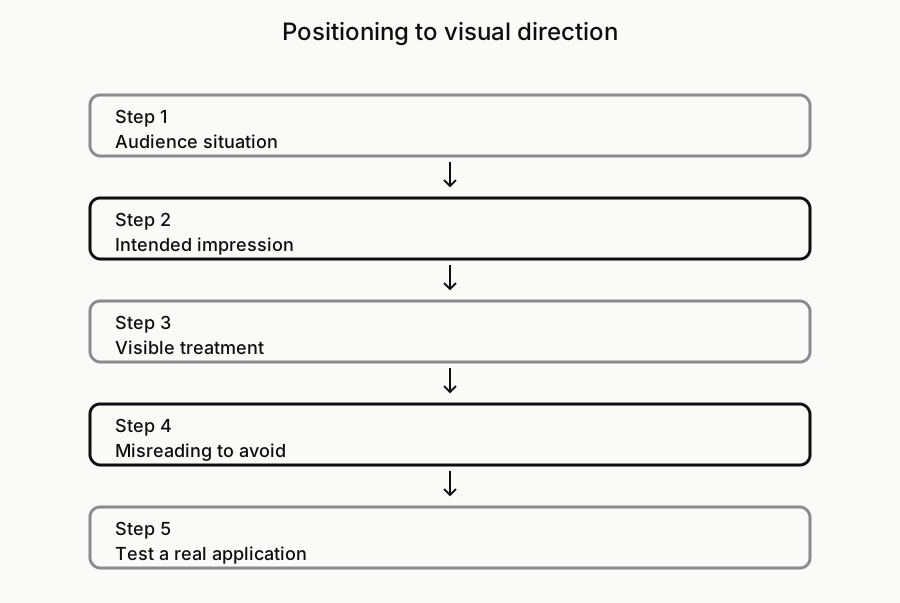
Use one row for each positioning idea. Write the audience's situation, the desired impression, a visible design treatment and the risk of misreading it. Then name an application where the treatment will be used. This does not prove what every customer will feel. It makes your intended meaning explicit enough to review and, where appropriate, test with real people.
Consider a hypothetical bicycle repair service for commuters. The intended impression is practical care. A useful direction might combine straightforward type, close-up repair photography and concise service labels. The risk is looking like a specialist racing brand if every reference features competition equipment. Test the direction on a repair estimate and a shop sign, not only a large moodboard. The worksheet diagram keeps that chain visible.
- Audience situation: Who needs the brand, and in what moment?
- Desired impression: What should the visual direction help communicate?
- Visible treatment: What can a designer actually change?
- Misreading to avoid: What unintended message could this treatment send?
- Application test: Where will the direction be used outside this board?
Compare directions that make different arguments
If you need alternatives, make each board a coherent proposal with its own rationale. One direction might emphasize workshop craft; another could emphasize easy daily service. Keep the same positioning and application tests across the alternatives. Otherwise you are comparing a polished board with an unfinished one, or judging different business promises without noticing.
Do not merge the most liked image from every direction immediately. A combination may work, but first explain which shared principle holds it together. If one board depends on restrained typography and another depends on expressive lettering, the team needs to decide which approach leads. More references will not resolve a contradiction in the intended message. Store the unused alternatives with their notes for future projects.
Treat color meaning as a project hypothesis
Explain color through its role in the proposed system instead of declaring a universal emotional meaning. Ask whether it separates key information, supports the imagery and remains usable in the intended applications. A palette can look coherent on the board while failing on a small label or a text-heavy page. The visual direction needs an application test, not just an attractive swatch.
For the repair service, a dark base might carry service information and a small contrasting accent might identify actions. That is a proposed role, not a claim that one hue creates trust for every audience. Leave exact token values open until the design is developed and checked. Our token guide explains why sampled colors and inferred rules require different treatment.
Review with a decision record
Ask reviewers whether the direction supports the audience, whether the references tell the same story and which treatment could mislead. Record the answer as accepted, rejected or still open. A useful approval note names the principle and the reason. It should be possible to understand the decision without having attended the meeting.
For example: approve candid workshop imagery because it shows the service; keep concise labels; explore warmer type; reject racing imagery because it changes the audience. This record still leaves room for design development. It does not approve every reference as a final asset, resolve reuse permissions or specify the completed identity. Turn the accepted principles into a brief before commissioning the next stage.
Use the board as a selection, not the entire archive
Keep sources and alternative directions in a reference library, then select a smaller board for the decision in front of you. Explore the workflow in Sesavu and check its documentation for current capabilities. You will still need a board or document for presenting the identity proposal. This article does not assume Sesavu generates the identity, builds the presentation or supplies an automatic brand brief.[3][4]
Questions designers ask
Is a brand moodboard the same as brand guidelines?
A brand moodboard proposes a visual direction. Brand guidelines document the approved identity and how to apply it. Keep exploratory references separate from final logos, specifications and usage rules.
Can I make a brand moodboard before designing the logo?
Yes. It can help clarify the intended tone and the broader identity before logo exploration. It should leave the logo's exact form open. A board of finished competitor marks can narrow the exploration too early.
Sources checked
- Create a moodboard for a new brand identity — Lisa Furze
- Moodboards for brand identity — ManyPixels
- Explore Sesavu — Sesavu
- Sesavu documentation — Sesavu